Creating Block Plugins
In the previous section, we explored how Magicube represents content as structured JSON. Now it’s time to put that knowledge into practice. In this section, we’ll build our first custom block: a simple, styled Callout Block, step by step.
Plugin API
In Magicube, everything is a plugin. Even the built-in paragraph block is implemented using the same public plugin API available to you. Blocks like headings, image, and lists are all built this way. That’s what makes Magicube powerful: the same tools we use internally are fully available for your custom blocks. Let’s dive into the plugin API by building a new block from scratch.
Package Setup
To stay focused on our goal, we’ll place both the editor setup and the custom plugin in the same app, structured as a simple web project rather than a library or monorepo. That said, keep in mind that a custom block can be packaged and distributed just like any other React library.
Let's start our app from where we just left the Hello World example in the Getting Started section. First we install the editor itself
yarn install @magicube/editor
Then we create its component
"use client";

import { Editor, createMagicubeEditor } from "@magicube/editor";
import "@magicube/editor/styles.css";

const editor = createMagicubeEditor();

function SimpleEditor() {
  return <Editor editor={editor} />;
}

export default SimpleEditor;
By now, we have only a paragraph block available
Or goal is to implement a callout block and add it to editor as an argument to createMagicubeEditor. Let's do it.
Plugin's Factory
We’ll create a new file called plugin.tsx. In it, we import ContentBlockPlugin from @magicube/editor and return a plugin object using the factory pattern.
import { ContentBlockPlugin } from "@magicube/editor";

// Callout Component implementation
// ...

export const makeCalloutPlugin = (): ContentBlockPlugin => ({
  goalVersion: '0.1.0',
  schema: {
    type: 'callout',
    render: Callout,
    isPlainText: true,
    isChildless: true,
  },
});
Here we have
- goalVersion - The version of Magicube Editor that this block is built for. This helps ensure compatibility and prevents issues with breaking changes. Our editor is currently at v0.1.0, so we match that version here.
- schema.type - A unique string to identify your block. This must not conflict with other types registered in the same editor. If you ever want to implement a second version of an existing block like heading-1, you can use the same type, but don’t register both at once in a single editor.
- schema.render - The React component that handles the block’s rendering. We’ll implement it next.
- schema.isPlainText - Defines whether the block supports marks like bold or italic. For now, we’ll keep things simple and use plain text, so this is set to true.
- schema.isChidless - Indicates whether the block accepts children. Now, we’re not nesting anything, so we set this to true.
Block Component
Now let's implement the block component itself
import { JSX } from "react";
import { BlockRenderComponentProps, DisplayIconProps } from "@magicube/editor";

export const Callout = (props: BlockRenderComponentProps): JSX.Element => {
  return (
    <div className="p-2 bg-yellow-100 flex gap-2 rounded-sm">
      <div>⚠️</div>
      <div {...props.attributes}>{props.children}</div>
    </div>
  );
};
This component is quite similar to any regular React component, but since it's meant to be rendered inside the Magicube Editor, there are three key things to keep in mind:
- It must receive BlockRenderComponentProps — These props are injected automatically by the editor.
- It must spread props.attributes onto the text container — This ensures proper syncing between the visual editor and the internal JSON structure.
- It must render props.children — This is where the editor will inject the editable content.
Once that’s done, we can register our plugin in the editor setup:
//...
const editor = createMagicubeEditor({
plugins: {
blocks: [makeCalloutPlugin()],
},
});
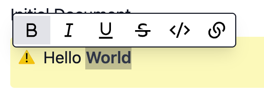
//...With that, the Callout block will appear in the block menu and be ready to use. Just click “Add new block” → “Callout” and start typing.

Now we have our first working custom block! It doesn’t yet support rich text, children or different callout variants like Alert 🚨 or Tip 💡 — but we’ll get to that next.
Adding Rich Text
To allow formatting, set "isPlainText" to false. Now marks like bold or italic are allowed.
export const makeCalloutPlugin = (): ContentBlockPlugin => ({
  goalVersion: '0.1.0',
  displayName: 'Callout',
  schema: {
    type: 'callout',
    isPlainText: false,
    isChildless: true,
    render: CalloutBlock,
  },
});
They will not be available since we did not add them to editor. Let's just add marks from typography plugins by now
//...

const editor = createMagicubeEditor({
  plugins: {
    blocks: [makeCalloutPlugin()],
    marks: makeMarks(),
  },
});

//...
Adding Child Support
Adding children support is easy too. Just change isChildless to false. Then just add a block bellow and press "Tab" to nest it.

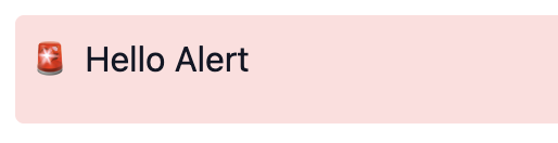
Another Type of Callout - Block Data
By now, our callout has only style. Let's add two other options
- Alert 🚨
- Tip 💡
To implement that, we can use the data prop
export const Callout = (
  props: BlockRenderComponentProps<CalloutData>
): JSX.Element => {
  const { data, children, attributes } = props;
  const { emoji, colorClassName } = getModeStyle(data?.mode ?? "warning");

  return (
    <div className={`p-2 flex gap-2 rounded-sm ${colorClassName}`}>
      <div>{emoji}</div>
      <div {...attributes}>{children}</div>
    </div>
  );
};

function getModeStyle(mode: CalloutData["mode"]) {
  if (mode === "alert") {
    return { emoji: "🚨", colorClassName: "bg-red-100" };
  }
  if (mode === "tip") {
    return { emoji: "💡", colorClassName: "bg-blue-100" };
  }
  return { emoji: "⚠️", colorClassName: "bg-yellow-100" };
}

type CalloutData = { mode: "alert" | "warning" | "tip" };
Here we add { mode: "alert" | "warning" | "tip" } type to generic BlockRenderComponentProps to represent the expected data type. Then, we take the styles based on the incoming data.
But where this data is coming from? We can set its initial value directly in plugin definition
export const makeCalloutPlugin = (): ContentBlockPlugin<CalloutData> => ({
  goalVersion: '0.1.0',
  schema: {
    type: "callout",
    render: Callout,
    initialData: { mode: "alert" },
    isPlainText: false,
    isChildless: false,
  },
});
To change values on the fly, you may want to use useState. It works, but won't persist the data in the document JSON. To actually update the data and update document JSON, use updateBlockData from useBlock hook.
For this example, we update on emoji click
export const Callout = (
  props: BlockRenderComponentProps<CalloutData>
): JSX.Element => {
  const { data, children, attributes } = props;
  const { updateBlockData } = useBlock();
  const currentMode = data?.mode ?? "warning";
  const { emoji, colorClassName } = getModeStyle(currentMode);

  return (
    <div className={`p-2 flex gap-2 rounded-sm ${colorClassName}`}>
      <div
        onClick={() => updateBlockData({ mode: changeMode(currentMode) })}
        className="cursor-pointer"
      >
        {emoji}
      </div>
      <div {...attributes}>{children}</div>
    </div>
  );
};

const changeMode = (mode: CalloutData["mode"]) => {
  const modes = ["alert", "warning", "tip"];
  const currentIndex = modes.indexOf(mode);
  const nextIndex = (currentIndex + 1) % modes.length;
  return modes[nextIndex];
};
The data will be reflected in the document JSON
{
  "id": "4697754d-31f3-4093-996b-c8b60c60184e",
  "type": "callout",
  "content": [
    {
      "text": "Hello World"
    }
  ],
  "children": [],
  "data": {
    "mode": "tip"
  }
}
Readonly
Finally, in view mode, we usually don’t want editing behavior. To handle that, you can define a custom component for the block's read-only representation and register it using a dispatcher.
const CalloutViewOnly = (
  props: BlockRenderComponentProps<CalloutData>
): JSX.Element => {
  const { data, children, attributes } = props;
  const currentMode = data?.mode ?? "warning";
  const { emoji, colorClassName } = getModeStyle(currentMode);

  return (
    <div className={`p-2 flex gap-2 rounded-sm ${colorClassName}`}>
      <div>{emoji}</div>
      <div {...attributes}>{children}</div>
    </div>
  );
};

const CalloutEdit = //... current implementation

// dispatcher
export const Callout = (
  props: BlockRenderComponentProps<CalloutData>
): JSX.Element => {
  const { readonly } = props;
  return readonly ? <CalloutViewOnly {...props} /> : <CalloutEditable {...props} />;
};

//...
When rendering content in view mode, just use the Viewer instead of the Editor—and don’t forget to register the same blocks in your viewer config to ensure consistent output.
import { Viewer, createMagicubeViewer } from "@magicube/editor";
import "@magicube/editor/styles.css";

const viewer = createMagicubeViewer({
  plugins: {
    blocks: [makeCalloutPlugin()],
    marks: makeMarks(),
  },
});

function SimpleViewer() {
  const document = //...

  return <Viewer document={document} viewer={viewer} />;
}

export default SimpleViewer;
If you're not using React on view, you can still render content by parsing the JSON output and building your own renderer.
We’ve learned a lot about custom blocks in this section. Next, we’ll go deeper and explore how to build blocks with sub-blocks—essential for related structures like list item or radio buttons.