Creating Mark Plugins
Marks are inline formatting tools that work within rich text blocks. Want to add some style to text? You need marks.
Magicube includes several built-in marks via the Typography Plugins package. When editing a rich text block, you can select text and use keyboard shortcuts to apply or remove formatting instantly.
- Bold - Cmd/Ctrl+B
- Italic - Cmd/Ctrl+I
- Underline - Cmd/Ctrl+U
- Strikethrough - Cmd/Ctrl+Shift+S
- Code - Cmd/Ctrl+E
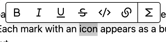
When you select text in a rich text block, a hovering toolbar also appears automatically. Each mark with an associated icon is displayed as a button in the toolbar. Clicking it toggles the mark on or off for the selected text.
Creating a Basic Highlighter Mark
Marks are also plugins in Magicube, just like blocks. Like we said before, there are several built-in marks available, but you can always implement your own custom marks. That's what we aim to do now.
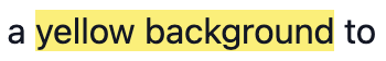
Let's create a simple highlighter mark that adds a yellow background to selected text. We'll break down each part of the implementation step by step.
Setting Up the Plugin
First, let's create the main plugin configuration. Every mark plugin needs several key components:
import {
  MarkPayload,
  MarkPlugin,
  MarkShortcutActivator,
  MarkShortcutKey,
} from "@magicube/editor";

export const makeHighlighterPlugin = (): MarkPlugin => ({
  goalVersion: "0.1.0",
  onCreateOrUpdate: (p: MarkPayload | null) => !p, // Toggle function
  shortcut: {
    activator: MarkShortcutActivator.META, // Cmd/Ctrl key
    key: MarkShortcutKey.H, // H key
  },
  hoveringToolbar: {
    icon: HighlighterIcon, // Icon for the toolbar
  },
  schema: {
    type: "highlight", // Unique mark identifier
    render: HighlighterMark, // Component to render the mark
  },
});
Plugin Parameters Explained
- goalVersion - The plugin API version based in the editor's version ("0.1.0" for now).
- schema.type - Unique identifier for the mark (appears in JSON output)
- schema.render - React component that renders the marked text itself.
- shortcut - Keyboard shortcut configuration (optional)
- hoveringToolbar.icon - Icon component for the floating toolbar (required for toolbar integration)
- onCreateOrUpdate - Function that receives the current mark value and returns the new value
The onCreateOrUpdate function is crucial — it receives the current mark value and should return the new value. For a simple toggle behavior, we use (p: MarkPayload | null) => !p, which flips between true and falsy (off).
Understanding Mark Values
In the JSON output, each text segment can include mark properties, represented as key-value pairs inside the content object. The key corresponds to the mark type, and the value represents the mark’s current value. This value is what gets stored for that mark type. If a key for a specific mark doesn’t exist in a text segment, that mark is considered undefined - and therefore not applied.
{
  "blocks": [
    {
      // ...
      "type": "paragraph",
      "content": [
        {
          "text": "This is regular text, "
        },
        {
          "text": "this is highlighted",
          "highlight": true  // Mark value: true
        },
        {
          "text": ", and this is regular again."
          // No "highlight" key = mark not applied
        }
      ]
    }
  ]
}
Text content is automatically merged or split based on the marks applied. If two adjacent text segments share the same marks, Magicube will merge them into a single segment. On the other hand, if you apply different marks within a segment, it will be split automatically to reflect those changes. This helps keep the final JSON output as clean and minimal as possible.
Creating the Mark Component and Icon
The mark component is what actually renders the formatted text. It receives the text content as children and should wrap it with the appropriate styling. Let's create it now
import { MarkRenderComponentProps } from "@magicube/editor";

// ...

const HighlighterMark = ({ children, className }: MarkRenderComponentProps) => {
  return (
    <span className={`bg-yellow-200 ${className}`}>
      {children}
    </span>
  );
};
The icon component HighlighterIcon appears in the hovering toolbar when text is selected. It should be an SVG icon that clearly represents the mark's function.
The shortcut uses Cmd+H (or Ctrl+H on Windows/Linux). The icon appears in the hovering bar when text is selected, allowing users to quickly apply highlighting.
Integrating the Mark Plugin
Now, we just add the factory function to the editor:
import { Editor, createMagicubeEditor } from "@magicube/editor";
import { makeBlocks, makeMarks } from "@magicube/editor-typography-plugins";
import { makeHighlighterPlugin } from "./plugin";

const editor = createMagicubeEditor({
  plugins: {
    blocks: makeBlocks(),
    marks: [...makeMarks(), makeHighlighterPlugin()], // Add to existing marks
  },
});

function HighlighterEditor() {
  return <Editor editor={editor} />;
}
The full example is available here:
basic-highlighter-mark
 Live Example
Marks with Input Components
Sometimes you want to select options for a mark, like choosing a highlight color. For this, you can use an input component instead of the simple toggle behavior.
Function vs Input Component
In our basic highlighter, we used onCreateOrUpdate function for simple toggle behavior. For more complex interactions, you can replace this with an input component that allows users to configure the mark before applying it.
Let's create a more sophisticated highlighter that lets users choose between four colors. First, we'll set up the plugin structure without the input:
import {
  MarkPlugin,
  MarkShortcutActivator,
  MarkShortcutKey,
} from "@magicube/editor";

export const makeAdvancedHighlighterPlugin = (): MarkPlugin => ({
  goalVersion: "0.1.0",
  shortcut: {
    activator: MarkShortcutActivator.META,
    key: MarkShortcutKey.H,
  },
  hoveringToolbar: {
    icon: HighlighterIcon, // Same icon as before
  },
  input: HighlighterColorInput, // We'll add this next
  schema: {
    type: "highlight",
    render: AdvancedHighlighterMark,
  },
});
Creating the Input Component
The input component receives the current mark payload and must call onSubmit with the new mark value when the user makes a selection. This new value becomes the mark's payload:
import { MarkInputComponentProps, MarkRenderComponentProps } from "@magicube/editor";

// Color selection input component
const HighlighterColorInput = ({
  payload,
  className,
  onSubmit,
}: MarkInputComponentProps) => {
  const currentColor = (payload as HighlightColor) || "yellow";
  const colors: { value: HighlightColor; bgClass: string }[] = [
    { value: "yellow", bgClass: "bg-yellow-200" },
    { value: "green", bgClass: "bg-green-200" },
    { value: "blue", bgClass: "bg-blue-200" },
    { value: "pink", bgClass: "bg-pink-200" },
  ];
  return (
    <div
      className={`${className} bg-white shadow-lg flex flex-col rounded border px-2 py-2 w-full h-full`}
    >
      <div className="grid grid-cols-2 gap-1 w-full h-full">
        {colors.map((color) => (
          <button
            key={color.value}
            className={`${color.bgClass} p-2 rounded w-2 h-2 hover:opacity-80 border-2 cursor-pointer ${
              currentColor === color.value
                ? "border-gray-800"
                : "border-transparent"
            }`}
            onClick={() => onSubmit(color.value)}
            onMouseDown={(e) => e.preventDefault()}
          />
        ))}
      </div>
    </div>
  );
};

type HighlightColor = "yellow" | "green" | "blue" | "pink";

const colorMap = {
  yellow: "bg-yellow-200",
  green: "bg-green-200",
  blue: "bg-blue-200",
  pink: "bg-pink-200",
};

// Enhanced mark component that uses the color payload
const AdvancedHighlighterMark = ({ children, className, payload }: MarkRenderComponentProps) => {
  const color = (payload as HighlightColor) || "yellow";
  const bgClass = colorMap[color] || "bg-yellow-200";

  return (
    <span className={`${bgClass} ${className}`}>
      {children}
    </span>
  );
};
The full example is available bellow:
advanced-highlighter-mark
With the advanced highlighter, your JSON output includes the color information:
{
  "blocks": [
    {
      "id": "block-id",
      "type": "paragraph",
      "content": [
        {
          "text": "This is "
        },
        {
          "text": "yellow highlighted",
          "highlight": "yellow"
        },
        {
          "text": " and this is "
        },
        {
          "text": "blue highlighted",
          "highlight": "blue"
        },
        {
          "text": " text."
        }
      ]
    }
  ]
}
Notice how the mark payload stores the specific color value ("yellow", "blue") instead of just true. This allows for rich mark data that can be used when rendering the content.
That is it! We learn how to create marks! Next, we'll explore inline elements to learn how to have void elements alongside text, opening up possibilities for things like mentions, bookmarks, and other interactive inline components.